

Conversion rate by sessions or by users
Pin the number down before you take any testing advice. Two published metrics carry this name and they disagree. The same store in the same month produces two different rates depending on which one you picked.
Google Analytics defines two metrics with this name in its own Data API schema. One divides by sessions, the other by users. A person can visit five times before buying, so the session denominator is usually larger, and the two figures separate further as visits per buyer rise. Whichever one your dashboard shows decides every comparison you make afterwards.
Two percent of what?
The denominator is the whole argument.
This matters most when you want to compare yourself to something. IRP Commerce publishes monthly ecommerce data and states its basis outright: transactions divided by sessions, times one hundred. Compare a user-based rate from your dashboard against that and you are flattering yourself, without knowing by how much.
The benchmark itself falls apart on inspection. In IRP's July 2026 data the highest sector, Arts and Crafts, converts at 5.23 percent. The lowest, Baby and Child, converts at 0.55 percent. That is a 9.5 times spread inside the same dataset, in the same month, measured the same way.

The same question, what sits under the line, is why ads inside ChatGPT cannot be priced yet: no benchmark has been published at all. So when somebody asks whether two percent is good, the question is missing two things: which denominator, and which sector. Supply both and it becomes answerable. Leave them out and it is a horoscope. What a conversion rate is, including the two GA4 metrics, is set out separately.
How often CRO test ideas produce a real improvement
Run one test, lose, and the instinct is that something went wrong. A losing test is the normal outcome. The companies with the best experimentation programs in the world publish success rates that would alarm most marketing teams.
Most tested ideas do not survive measurement.
Kohavi, Deng and Vermeer collected published historical success rates for large experimentation programs in their KDD 2022 paper. These are the shares of ideas the organisation itself believes were genuine improvements.
One condition sits upstream of the sample requirement. The 41,642-visitors-per-variant requirement belongs to one specific setup: a 3.7 percent baseline, a ten percent relative improvement and eighty percent power. Change any of the three and your own requirement moves, sometimes by a lot. If you cannot reach the number your own inputs produce, something upstream has to change first, and traffic is one candidate. That has several possible causes and only one of them is whether the catalogue is being crawled at all, which is what an ecommerce SEO audit settles.

The definition is where most published win rates go wrong, and fixing it makes independent samples converge. ConversionTeam audited 2,288 tests across 71 accounts in June 2026 and pulled three different win rates out of one dataset. 50.5 percent showed a raw uplift. 19.1 percent reached statistical significance. A third, higher figure counted every directional result that got implemented. CXL, analysing 28,304 experiments in 2019, put the significant share near 20 percent. A win rate quoted without saying which of the three it means cannot be compared to anything.
None of this tells you whether a given test was run correctly. That is a separate discipline with its own failure modes, and how to run an A/B test covers the split unit, the validity checks and the peeking problem.
Read that as a design constraint, not bad news. If one idea in ten works, shipping one test a month finds roughly one improvement a year. Shipping one a week finds five. The rate of winning is not your lever. The rate of trying is.
It also explains why redesigns keep disappointing. A redesign is one bet at the success rate above, with everything changed at once, so you cannot tell which part helped. A weekly programme is fifty bets a year with attribution attached to each.
Why does the most-shared CRO case study fail?
Fifty bets a year only compound if you read them honestly. The most famous result in this field was read badly. In 2022 a peer-reviewed KDD paper took the most-circulated A/B test in conversion optimization and worked through its arithmetic in public. It did not hold, and the reason it did not is the same reason most case studies do not.
The test was published in December 2021 under the headline "Which design radically increased conversions 337%?" and it compared two landing pages over 35 days with traffic split evenly. Kohavi, Deng and Vermeer reproduced its numbers in full.
KDD 2022, Table 1The whole result, and what it rests on
The table is reproduced from Table 1 of Kohavi, Deng and Vermeer, KDD 2022, authors’ version read 7 October 2026. The callout under it is Addition’s summary of the paper. The paper’s sentence: “Given the data presented, we strongly believe that this result should not be trusted.”

The original write-up reported a p-value of 0.009, well under the usual 0.05 threshold, and an observed power of 97 percent, described as well beyond the accepted 80 percent minimum. Both numbers are real. Neither means what the article took it to mean.
Here is the arithmetic. To detect a 10 percent relative change on a 3.7 percent baseline with 80 percent power, you need 41,642 visitors per variant. The test had about 80. At that sample size the power to detect a 10 percent change is 3 percent.
A p-value is not a sample size.
The same failure shows up wherever a small sample gets read as a signal, which is why a paid campaign should not be judged on three days of data either.
The arithmetic only works if both sides agree on what a conversion rate is. The tiny sample and 3 percent power are why the p-value did not save it. A p-value answers a narrow question about one dataset. It says how often noise alone would produce a result this extreme if there were no effect. It does not say how often a significant result is wrong. That depends on how many of the ideas being tested are real, and the paper puts a number on that too.

A false positive here means the test reported a win that was not real: the result cleared the significance threshold by chance. Low power raises that share for arithmetic reasons, not statistical ones. Walk through it once.
| Out of 1,000 tested ideas | Count |
|---|---|
| Genuine improvements, at a 10 percent success rate | 100 |
| No real difference | 900 |
| Winners the test detects, at 20 percent power | 20 |
| No-difference ideas flagged as wins by chance, at 2.5 percent | 22.5 |
| Reported back to you as significant wins | 42.5 |
| Of those, false positives | 22.5, or 52.9% |
The test above was powered at 3 percent, which is off the bottom of that chart. The paper's own conclusion is blunt: “Given the data presented, we strongly believe that this result should not be trusted.” It also notes what happened next. The publisher added that the experiment was underpowered and suggested a replication run. That is the right response, and almost never the one that happens.
Why observed power is not a defence
The 97 percent figure is the trap, because it sounds like exactly the reassurance you want. Observed power is calculated after the fact, by assuming the effect you measured is the true effect. When a small sample inflates the measured effect, the observed power inherits the inflation and hands back the number you were hoping for.
Kohavi and colleagues cite Hoenig and Heisey's 2001 paper, The Abuse of Power, which names this the power approach paradox and calls the reasoning behind it a fatal logical flaw. A 2024 walkthrough of observed power reaches the same verdict for online tests specifically. The walkthrough summarises the distinction in one sentence: the argument holds for power calculated before an experiment, and fails spectacularly for post-hoc, or observed, power.
One further consequence deserves to be better known. The paper cites Gelman and Carlin: when power drops below 0.1, the probability of getting the direction wrong approaches 50 percent. Not the magnitude, the sign. A badly underpowered test is not a rough estimate of the truth. It is a coin flip on whether your change helped or hurt.
Test priorities when you cannot test everything
With a success rate near one in ten and a sample requirement in the tens of thousands, most stores cannot test everything. So fix what is unambiguously broken without testing it, and spend your testing capacity on genuine uncertainty.
Fix the unambiguous things without testing them
Speed has one of the larger published associations, and the study behind it is unusually big. Deloitte measured 37 brands across more than 30 million sessions for Google in 2020. Sites 0.1 second faster on four mobile speed metrics converted 8.4 percent better in retail and 10.1 in travel. That is an observed relationship across sites, not a controlled experiment. Treat it as a strong reason to prioritise speed work, not a promised return. Speed is also the one place with a published number to hit. The Core Web Vitals thresholds are the closest thing to a pass mark anywhere in this work.
Broken is not a hypothesis.
The checkout is also where an AI answer that names your store finally gets paid off, so AI search engine optimization and this work share a finish line.
Start at the checkout, and there is a published reason to. Baymard Institute puts the average documented cart abandonment rate at 70.22 percent, across 50 separate studies read in August 2026. That is a large number and an average of averages, and neither of those is a measurement of your own checkout. Before you use that average as a target, read what it is made of. Checkout optimization breaks it down. Somebody has measured the surface it leaks through. Baymard measured the average checkout in 2024 at 5.1 steps and 11.3 form fields, down from 12.7 in 2019, and puts the number most sites need at 8 fields.
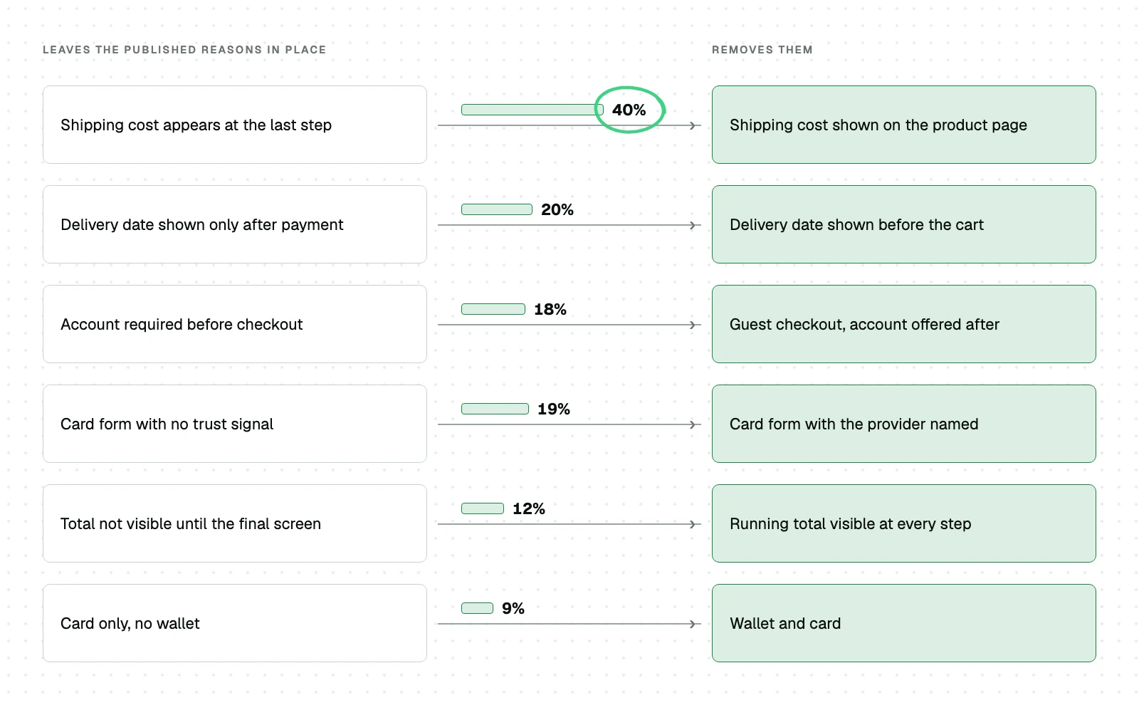
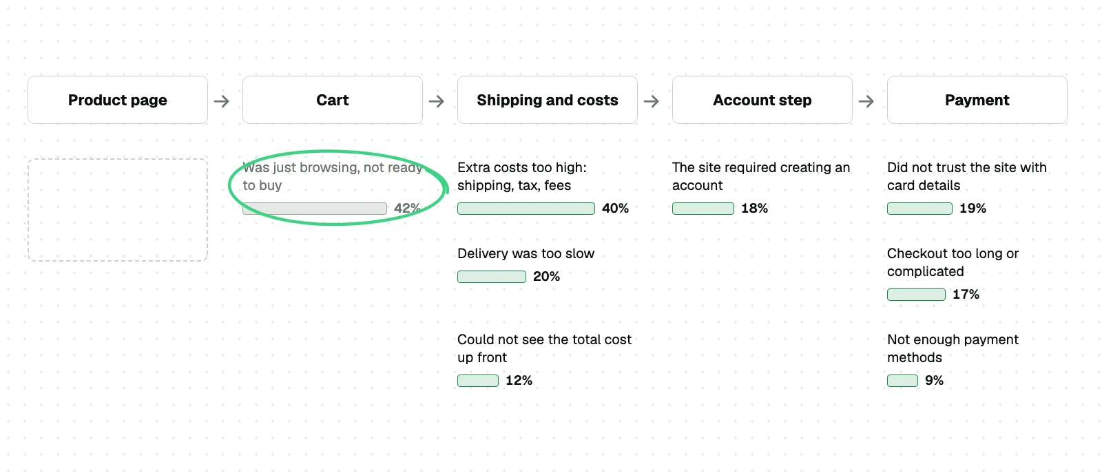
The headline number hides something that changes what you do about it. Baymard sets one group aside from the rest of its list: shoppers who were browsing and not ready to buy. Those abandonments are largely unavoidable, and a share of any cart abandonment average is made of them.
| Reason given for abandoning | Share of shoppers | Fixable by design |
|---|---|---|
| Extra costs too high: shipping, tax, fees | 40% | Yes |
| Delivery was too slow | 20% | Partly, it is an operations problem shown late |
| Did not trust the site with card details | 19% | Yes |
| The site required creating an account | 18% | Yes |
| Checkout too long or complicated | 17% | Yes |
| Could not see the total cost up front | 12% | Yes |
Now the arithmetic that follows from it. The 70.22 percent is an average of fifty studies and the 42 percent comes from a different survey of shoppers, so the two do not multiply. What the second number establishes is that a large share of abandonment is people who were never going to buy today. So read the headline as an upper bound, not a target, and a recovery campaign is aimed at an audience well under the size the business case usually assumes. The reasoning is not new: it circulates in the field, and Baymard itself sets the browsing group aside precisely because those abandonments are largely unavoidable. What is rare is doing the arithmetic before writing the business case, not after it underperforms.
Say you want to hand parts of this work to an agent. The CRO skills shelf holds five skills that do, from the first page read to the test design.
Suppose you want the research-first version for your page, with the objection table and the ten-times screen for what you test. That is the cro-methodology skill.
Say you want a first structured read of your page, in the seven dimensions above. The cro skill returns one from your URL and your stated goal.
-
Fix the things that do not need a test
A missing delivery date, hidden shipping cost, or a forced account is a known cost with a documented failure mode. Testing whether people like being surprised by a shipping fee is spending traffic to confirm something already measured.
-
Compute the sample you need before you design the test
If your traffic cannot reach it in a reasonable window, do not run that test. Pick a bigger change, a higher-traffic page, or a more frequent metric such as add-to-cart, not purchase.
-
Write the falsifier before launch
What result would make you abandon this idea? If nothing would, the test is decoration. This is also where the metric gets fixed, before you can see which one would tell a nicer story.
-
Run to the planned horizon and do not peek
Stopping when it looks significant inflates your false positive rate, and the KDD paper names a real platform that recommended exactly this practice until it was shown to be wrong.
-
Record the belief, not just the number
A test that says the green button won teaches you nothing. A test that says buyers here need reassurance about delivery before price teaches you what to try next.
-
Treat a spectacular result as a warning
The paper invokes Twyman's law: any figure that looks interesting or different is usually wrong. A 300 percent lift is a prompt to check the sample, not to write a case study.
CRO program budget and your traffic level
The answer starts with a question about your traffic, because below a certain volume the expensive version of this work cannot pay back. Nobody selling it will tell you that, and it decides whether any of this applies to you.
How to work backwards from the sample
A test that cannot finish is not a test.
Which is why the budget question underneath this one, CRO or more traffic, is decided by your traffic level before it is decided by preference.
That constraint is why the cheapest CRO work is often not CRO at all. Traffic that never arrives cannot be tested, and the denominator in what a conversion rate is decides whether you even have enough of it to measure.
Work backwards from the sample requirement. A test needing 40,000 visitors per variant needs 80,000 visitors to finish. If your store sees 20,000 a month, that is roughly one test every four months. A quarter is far too long a feedback loop to justify a retainer built around testing.

Under that threshold, the money is better spent on the fixes that do not need a test and on getting more qualified traffic in the first place. That is not a smaller version of a CRO program. It is a different job, and pretending otherwise is how stores end up paying monthly for tests that can never reach significance.
Above it, the cost is mostly people, not tools. Testing software is a small line next to the research, the build and the analysis, and the analysis is where the money either works or does not. A supplier who cannot tell you their planned sample size before launch is not doing the expensive part.
Ask any supplier two questions, and both have one-sentence answers. What sample size are you planning for? And what result would make you call this test a loss? A supplier without ready answers is selling you the build.
On Shopify a separate constraint is fixed before anyone asks. Your plan decides how much of the checkout you may touch. A quote for a checkout test should name that limit first, and Shopify conversion rate optimization starts there.
If traffic is the binding constraint and not the conversion rate, start at the cheaper end with ecommerce SEO services from Addition, a search marketing agency. An ecommerce SEO audit is how you find out which constraint is yours.
Measuring conversion rate optimization by revenue per visitor
Whatever the programme costs and wherever the traffic comes from, it gets judged on one number, and the usual one is the wrong number. Conversion rate is what everyone reports and it is the wrong one to steer by, for a reason that shows up constantly. It can rise while the business gets worse, and there is nothing pathological about how that happens.
How a good number hides a bad quarter
The dashboard can improve while the business does not.
Discount deeply enough and conversion rate goes up while revenue per visitor goes down. The same reversal decides whether a click you already paid for was worth its price, and how Google Ads works is where that price was set. A cheaper conversion at a smaller order is not a better one. Remove a genuine upsell and the same thing happens: more people complete a smaller order. In both cases the metric on the dashboard improves and the business does not.
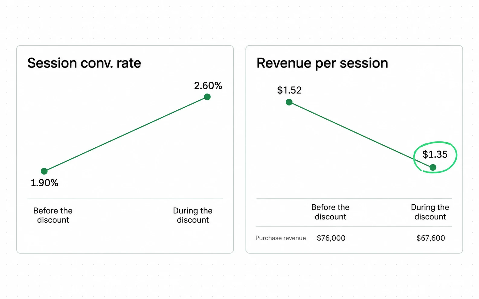
The same trap prices your advertising. The auction in how Google Ads works does not care what happens after it. So when a landing page converts more people into smaller orders, the campaign report improves while the margin does not.
Contentsquare's 2026 benchmark, across 99 billion sessions on 6,500 sites, shows the same split at industry scale: conversion rate fell 5.1 percent year over year while frustration signals like rage clicks fell 4.3 percent. Lower frustration did not coincide with higher conversion, and lower frustration alone is not enough to say the experience improved. Revenue per visitor carries the order value inside it, so it moves when either the rate or the value does. Margin sits outside it and needs its own check. Report conversion rate and average order value underneath it as the decomposition, so you can see which one moved, but make the verdict on revenue per visitor.
Then hold the denominator fixed. Whichever of the two GA4 rates you chose, keep it, because switching mid-program produces a step change that looks like a result and is not.
Before your next test launches, write down the sample size, the primary metric and the stop date. It costs ten minutes, and it is what separates the programs in the KDD paper that compound from the ones that generate stories.
No mid-test peeking - Do not check full results before the experiment reaches the required sample size and duration. Early checks increase false positives. Single analysis at the end - Review outcomes only after you meet the experiment conditions (sample size and duration). Rigorous statistical standards - Maintain strict statistical standards through a traditional A/B testing process.
support.optimizely.com, statistical analysis methods overview read 10 September 2026
- Early checks increase false positives. The vendor writes that into the mode it ships, which is a stronger place for the rule to sit than in advice from somebody with nothing to lose.
- Two conditions, not one: the sample size and the duration. Reaching the visitor count early does not open the results.
- This is the fixed-horizon mode. The same page lists two others, and the note below is about what they change.
Open your analytics and put revenue per visitor beside conversion rate for the last quarter. If those two lines moved in opposite directions, something is converting more people into smaller orders, or fewer people into larger ones. Which of the two it is decides what to test, and the report will not tell you; the order data will.
Sources
- ConversionTeam A/B test win rate benchmarks from 2,288 audited tests across 71 accounts
- CXL Five things we learned from analysing 28,304 experiments Measured 7 years ago, on a surface that has moved since.
- Deloitte and 55, for Google Milliseconds Make Millions, 37 brands, 30M+ sessions Measured 6 years ago, on a surface that has moved since.
- Contentsquare 2026 Digital Experience Benchmark, 99 billion sessions across 6,500 sites
- Optimizely Statistical analysis methods overview, sequential testing and false discovery control
- VWO Enhanced SmartStats: Bayesian sequential testing with Bonferroni correction Measured 21 months ago, on a surface that has moved since.
- Gelman and Carlin Beyond Power Calculations: Assessing Type S (Sign) and Type M (Magnitude) Errors, Perspectives on Psychological Science 9(6), 2014
- Johari, Koomen, Pekelis and Walsh Peeking at A/B Tests: Why It Matters, and What to Do About It, KDD 2017
- Georgi Georgiev Using Observed Power in Online A/B Tests, Analytics-Toolkit
- Baymard Institute Checkout flow length and form fields, average of 5.1 steps and 11.3 fields Dated 2024 with no month given, so its exact age is not knowable from the source.
- AB Tasty Sample size calculation, the pre-launch discipline this checklist mirrors
- Kohavi, Deng and Vermeer A/B Testing Intuition Busters: Common Misunderstandings in Online Controlled Experiments, KDD 2022, peer reviewed
- Hoenig and Heisey The Abuse of Power: The Pervasive Fallacy of Power Calculations for Data Analysis
- IRP Commerce Ecommerce Market Data, July 2026, session conversion rate
- Baymard Institute Cart abandonment rate statistics, average of 50 studies This page carries no publication date of its own.
- Google Analytics Data API schema, sessionKeyEventRate and userKeyEventRate
Questions people ask
Is a 2% conversion rate good?
The question needs two more pieces before it can be answered: which denominator, and which sector. A rate counted per session and a rate counted per user are both standard in Google Analytics, and one store scores differently under each.
Once those are fixed, the sector spread does the rest. In IRP Commerce's July 2026 data, Arts and Crafts converted at 5.23 percent and Baby and Child at 0.55 percent. The all-markets average of 2.26 percent sits between two numbers that are nine times apart, which makes it a poor description of anybody.
What is the difference between SEO and CRO?
SEO changes how many people arrive. CRO changes what share of them buy. They are measured on different denominators and they fail in different ways.
The practical link is that CRO needs traffic to work with. A test that needs forty thousand visitors per variant cannot run on a store getting twenty thousand visits a month. So sequence the two instead of running them in parallel on a small store.
How to fix cart abandonment?
Start by accepting that a large part of it is not fixable. Baymard reports that 42 percent of US online shoppers have abandoned a cart simply because they were browsing and not ready to buy. It sets that group aside as largely unavoidable.
The addressable part is the rest of their list, and the top items are consistent: extra costs appearing late, slow delivery, distrust of the payment step, and forced account creation. Those are known failures with known fixes, so fix them instead of testing them.
What is a cart abandonment rate?
The share of shoppers who add something to a cart and leave without buying. Baymard puts the average documented rate at 70.22 percent, calculated across 50 separate studies.
The number is worth treating carefully, because a large slice of it is people who were never going to buy on that visit. Measured as a single figure it looks like a catastrophe. Split into avoidable and unavoidable, it becomes a work list.
What is the difference between CVR and CTR?
Clickthrough rate measures whether people click something, usually an ad or a link. Conversion rate measures whether they complete the action you wanted, usually an order.
They can move in opposite directions, and when they do it is informative. A rising clickthrough rate with a falling conversion rate normally means the ad is promising something the page does not deliver.