

What does checkout optimization cover?
By the time someone is filling in an address, most of the persuading is behind them. Not all of it: Baymard finds 42 percent of abandoners were just browsing or not ready. But the part of the flow that follows is a form, and a form either lets someone finish or it does not.
Checkout work is subtraction, not argument.
That is the useful distinction between this and the rest of conversion rate optimization. A product page has to make a case, the way a category page has to earn its ranking in ecommerce SEO. A checkout has to get out of the way. The two need different evidence, and treating them as one job is why so much checkout advice reads like copywriting advice.
It also sets the boundary of what a checkout change can do. If a store has a traffic problem, or a price problem, or nobody reaching the cart at all, a shorter form fixes none of it. The most a checkout change can reach is the people who got that far.
Where does the 70 percent cart abandonment figure come from?
Seventy percent of carts get abandoned. That is the figure this subject is introduced with, and what it measures is rarely stated alongside it, which turns out to change what you can do with it.
That seventy percent is not a measurement of ecommerce. It is a mean of other people’s measurements.
Based on the data we collected, we’ve calculated the average cart abandonment rate of 70.22%. This value is an average calculated based on 50 different studies containing statistics on ecommerce shopping cart abandonment.
Baymard Institute, cart abandonment rate list read 7 September 2026
- The figure everyone cites is not one measurement. It is an average across fifty studies with different methods and different years.
- That is worth knowing before you compare your own rate against it, because your store is one method and this is fifty.

So the reading has to be narrow. A store at 74 percent has not learned that it is worse than average. The average contains studies at 84 percent and studies at 55 percent, measuring different traffic in different decades. That number describes a body of research, not a store.
The figure does real work in real decisions. It is quoted to justify a checkout project, and it is the number the project is later judged against.
Cart abandonment reasons: one study quoted with two numbers
Baymard also publishes a breakdown of why people abandon, and that breakdown is what most checkout advice is built from. Read it closely, because half of it is not about your checkout at all.
Two published accounts of the reasons breakdown disagree, and the largest reason in one is absent from the other.
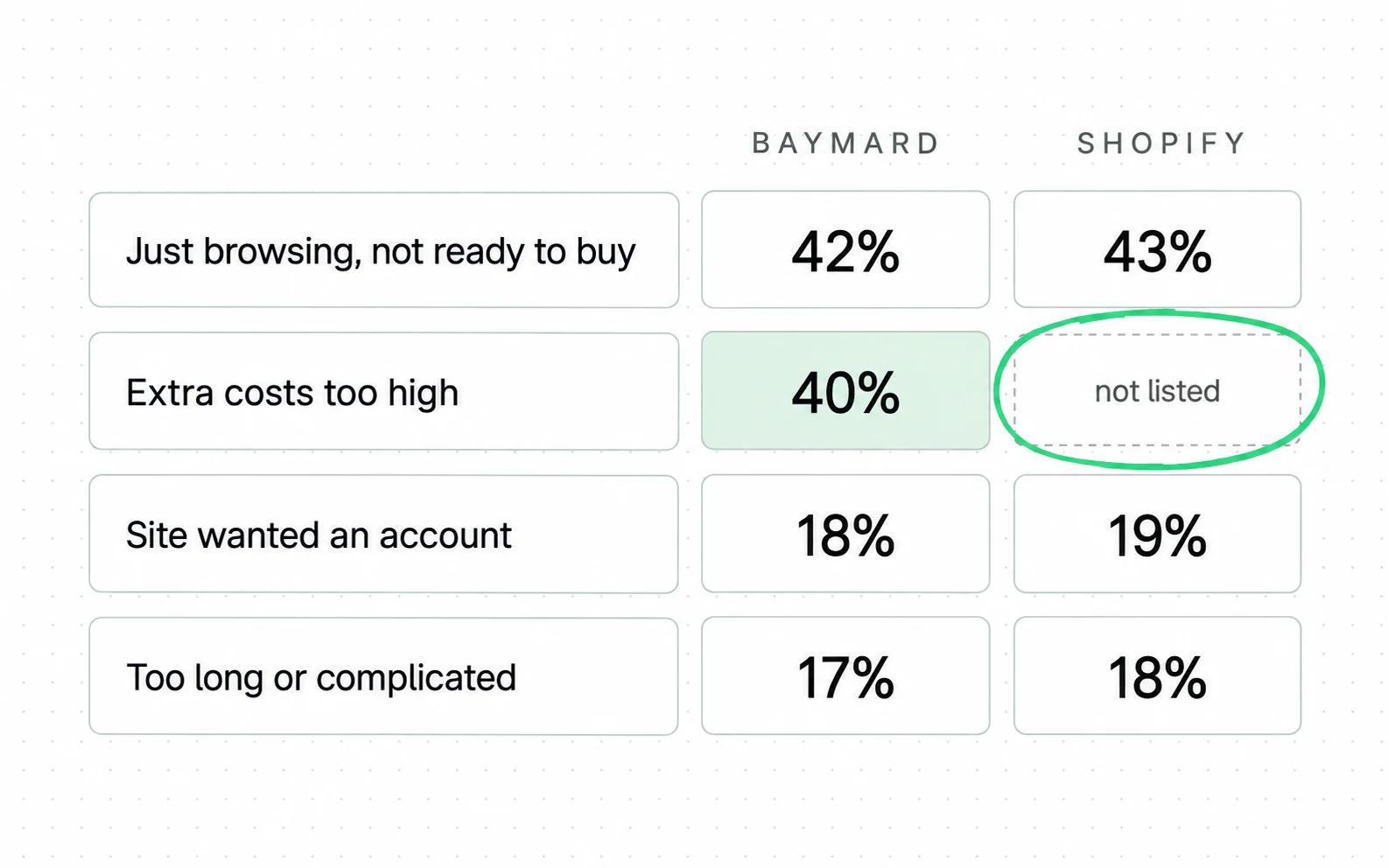
The practical consequence: any checkout priority list built from a second-hand version of these percentages is built on numbers you cannot pin to a measurement. Reordering your checkout roadmap because 19 percent beats 18 percent is reading a one-point gap that two accounts of the same study do not agree on. It is the same failure as reading a sector conversion rate as a target for your own.
Cost surprises, forced accounts, long forms and missing payment methods lose orders. The direction is steadier than any percentage attached to it. Bizrate Insights reaches the cost half independently, on a stated sample of 1,010 US adults, with 42 percent saying unexpected fees make them abandon often or very often. Two measurements taken separately land on the cost half, which is why it is the safe place to start.
The payment-methods leg is the thinnest of the four. It sits at 7 percent on Baymard’s own list, below a declined card at 9 percent, and no second source here measures it.
Checkout metrics you can count on your own store
If the published percentages cannot be pinned, the usable numbers have to come from your own flow. Stop comparing your abandonment rate to a benchmark that cannot receive the comparison, and count properties of your own checkout that have a published line to sit against.
Traffic source, business model and calculation method differ between stores, so your abandonment rate and a competitor’s are rarely measuring the same thing. Those differences are what make cross-store abandonment benchmarks unreliable.
One of those lines exists, and it is a count of form elements.
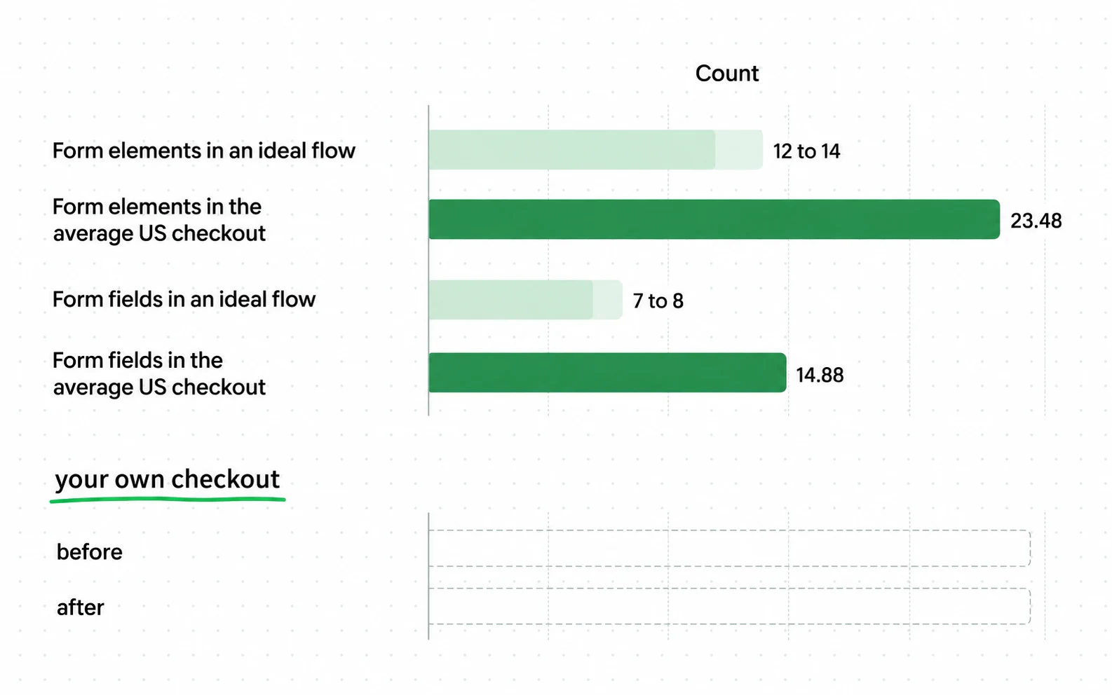
Four more properties are countable in the same sitting. Counting them is description; changing them is a separate decision. Four changes, and three are judgment calls a store with the traffic should test:
Checkout
Contact
Delivery address
Delivery method
Payment
Billing address
15 form elements before the Pay button
-
Where the total first appears
Count the clicks between landing on the cart and seeing shipping, tax and total together. Anything above zero is a decision someone made.
-
Whether an account is required
Not whether guest checkout exists, but whether it is the prominent option. A guest link under a login form is a guest checkout that most people never find.
-
How many payment methods are present
One is a policy. Count what a shopper can pay with today, including the wallet that fills the address for them.
-
How many fields carry an autocomplete attribute
This is the difference between a browser filling the form and a browser guessing at it, and it is covered next.
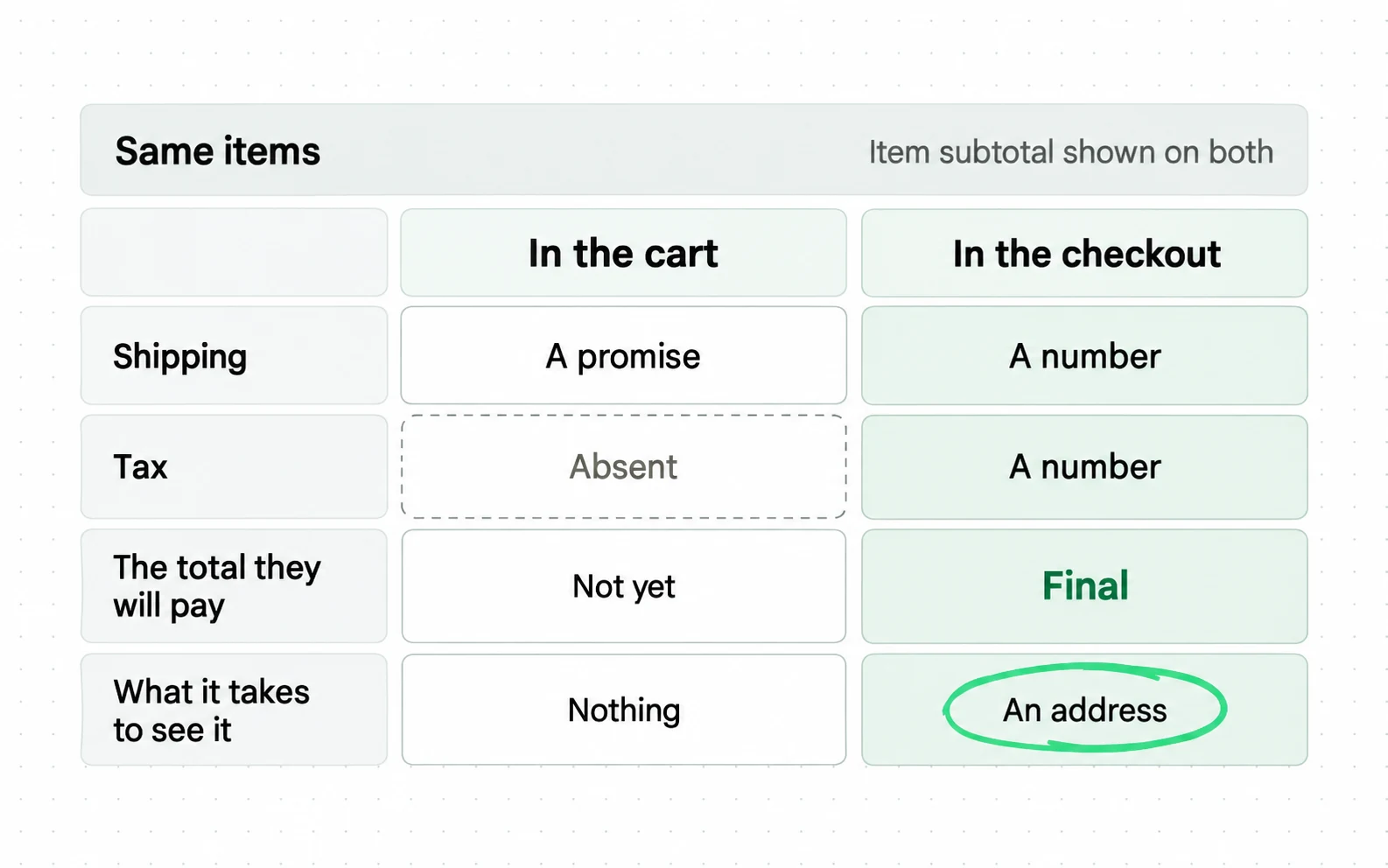
Counting these needs no experiment, because a count is not a claim. Where an experiment is required, and where most checkout tests go wrong, is covered in the method behind a CRO programme.
Checkout autofill: how to specify it so it works
Counting is free, and the first change that follows is nearly free too. Enabling autofill is standard advice. What makes it work is specific: a list of field names published in the HTML Standard.
The browser fills what you have labelled. It guesses at the rest.
The whole change, on two attributes
The difference, in the markup
WITHOUT the browser has to guess
1<input type="text" name="addr1" placeholder="Address">
<input type="text" name="pc" placeholder="Postcode">
WITH the browser is told
2<input type="text" name="addr1" autocomplete="address-line1">
3<input type="text" name="pc" autocomplete="postal-code">
- 1A name a developer invented. The browser can guess from it, and on a checkout it often guesses wrong or not at all.
- 2A value from the HTML Standard. There is no guessing left: the browser knows this field wants the first line of an address.
- 3Same for the postcode, and for every other field the specification names. This either matches the spec or it does not, which is why it needs no experiment.
The HTML Standard defines an autofill field name for each kind of data a form can ask for. Values like street-address, cc-exp and postal-code, plus a hint set that separates shipping from billing. Put those on the input and the browser knows exactly what the field is for. Leave them off and, as Google’s forms guidance explains, the browser falls back to matching on the name attribute and whatever else it can infer.
| What the input says | What the browser can do |
|---|---|
| No autocomplete attribute | Guess from the name attribute and prior form submissions |
| autocomplete="postal-code" | Fill the stored postcode |
| autocomplete="shipping postal-code" | Fill the shipping postcode, keeping billing separate |
| autocomplete="off" | Told not to help |
Give this more attention than the tactic lists do. It is the only item on any checkout checklist that is fully under your control, costs nothing, and either works or does not. Every other item is a judgment call.
Payment step rules you cannot design around
Attributes are yours to set. The next constraint is not. A checkout can be reduced right up to the point where regulation and card rules take over, and past that point the friction is not a design choice.
In Europe an extra step can be required by law, and you do not get to decide when.
Verify it is you
We sent a code to the phone ending 4417
- 1The address is the bank, not the store. The shopper is still buying, and the page is no longer yours.
Strong Customer Authentication has applied in Europe since 14 September 2019, under PSD2. Stripe’s documentation is direct about the consequence: card payments require 3D Secure to meet it, and integrations that are not ready "might see high rates of declines from banks that enforce SCA". Some low-risk transactions do not require authentication, and Stripe notes banks can still request it anyway, so the step is neither always present nor ever yours to remove.
So a European store cannot guarantee the payment step away, and a checklist that says to remove every step is wrong there. A store can leave authentication as the only step and remove the avoidable friction around it.
Declined cards sit on the same boundary. Baymard’s reasons list puts them at 10 percent, and form design does not reach the issuer’s decision. One nearby fact is worth keeping separate: Stripe says an integration that is not SCA-ready can itself see high decline rates. That is a different measurement from Baymard’s shopper survey, so treat it as a second thing to check, not part of the 10 percent.
What is in the headline checkout dollar figure?
The most cited justification for checkout work is a 35.26 percent conversion increase and 260 billion dollars in recoverable orders. Both come from Baymard, and both deserve to be read carefully before a budget is built on them.
The dollar figure is a multiplication, not a measurement.

The figure still has a legitimate use, which is to argue that checkout work is not marginal even at large scale, where teams have already run several rounds of it. Baymard says its benchmark of 60 leading sites still finds 39 potential improvements on the average one.
What it cannot be used for is forecasting your own result. Applying a percentage measured on Amazon-sized checkouts to your own is the same error as reading a sector average order value as a target.
Checkout optimization spend and your platform plan
Those figures set what the work might be worth, and what it costs is a separate question. The answer is mostly not agency time: it is what your platform lets you change, and on the biggest hosted platform that is set by which plan you are on.
Only the last change on this list needs a plan upgrade. The rest are settings or your own theme code.
| Change | On Shopify without Plus | Where the change lives |
|---|---|---|
| Guest checkout, and how prominent it is | A checkout setting | Platform settings |
| Payment methods present | A payment setting | Platform settings, plus the provider fee |
| Shipping rates shown earlier | A shipping and theme change | Settings and your theme |
| autocomplete attributes on your own theme forms | Yours to edit | Your theme code |
| Adding custom UI to the information, shipping or payment steps | Checkout UI extensions there are Plus-only | A Shopify Plus plan |
That table decides the order of work more than any priority framework does. On a hosted checkout the free changes are the settings and the theme. Adding custom UI inside the checkout steps is a plan purchase, not a build.
It also explains a pattern in the case studies platforms publish about themselves. The reported wins tend to be replatforming or adopting an accelerated wallet, because those are the changes the platform sells. A store that has not exhausted the free half should not be reading those as its next step.
No market price range is given here. Price depends on platform limits and implementation scope, so ask for a scoped quote instead of a generic figure.
Your plan decides how much of this list you can reach. Before a checkout test is scoped, the checkout limits on your plan set what is available to test. Shopify conversion rate optimization at Addition, a search marketing agency, starts from that list.
Four mistakes visible in the evidence above
Plan limits explain part of the bill. The rest goes on four decisions that are common enough to be the default and defensible on their face. Each cost shows up only after the decision has been made.
Four mistakes, and three are caused by trusting a number more than it can bear.
| The mistake | What it costs |
|---|---|
| Benchmarking your abandonment rate against 70 percent | A project justified or cancelled on a figure that describes a literature, not a store |
| Ordering the roadmap by the reasons percentages | Priorities set by a one to three point gap that two accounts of the same study do not agree on |
| Forecasting your own lift from 35.26 percent | A budget sized on results measured at Amazon and Walmart scale |
| A/B testing the free changes | Weeks of waiting before adding an attribute that has no downside |
There is a fifth that no amount of checkout work fixes: measuring the checkout while the traffic mix is moving. A discount week fills the cart with people who were never going to finish, and every checkout number moves without the checkout changing.
How to prioritise checkout work
Avoiding those four is not the same as knowing what to do first. Most of the published detail is not usable for prioritising, so priority comes from what is cheap to verify and what is irreversible.
Free and certain first. Expensive and uncertain last.
Suppose you want this list run as a programme on one flow. The conversion-optimization skill takes your leaking flow through six phases: measure, research, then message, offer, proof and friction.
-
Count what you show
Elements visible by default, against the 12 to 14 line. This costs ten minutes and tells you whether you have a form problem at all.
-
Add the autocomplete attributes
The token list is published, so this is a specification match, not a hypothesis. There is nothing here for an experiment to decide. If your checkout is on a hosted platform, check what it emits. Do not assume.
-
Move the total earlier
Shipping, tax and total on one screen before the payment step. What Baymard and Bizrate reach independently is the reason, which is cost surprise. Where on the page to end it is our answer, not theirs.
-
Make guest checkout the prominent path
Offer the account after the order, when it costs the shopper nothing.
-
Add the payment method your shoppers ask for
Ask support what people email about before adding a wallet on principle.
-
Then, and only then, test layout
Layout changes are where experiments belong. The five above either compare against a published benchmark, match a published specification, or answer a reason shoppers gave in a survey. A layout preference does neither.
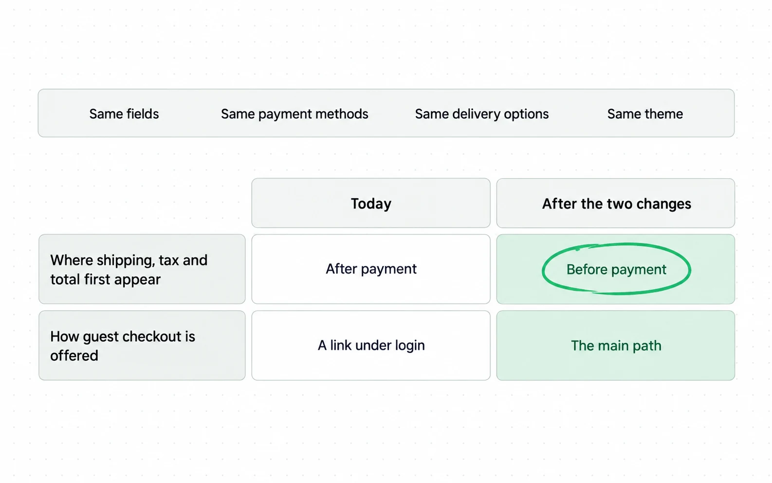
The first two are not experiments and cannot be: counting your elements is an observation, and an autocomplete attribute either matches the specification or does not. The three after them are judgment calls with a real case behind them, and a store with the traffic to test them should. Waiting for significance before adding an autocomplete attribute, though, is a way of never adding it.
How to measure whether checkout optimization worked
Once that list is running, the last decision is what to judge it on. The trap is the abandonment rate. It is the one number this work does not cleanly move.
Abandonment includes people who were never going to buy.
Baymard’s own data says 42 percent of abandoners were just browsing or not ready. That share sits inside your abandonment rate and moves with your marketing, your traffic mix and the season. A checkout change can work perfectly and be swamped by a week of cheaper traffic.
Contentsquare’s 2026 digital experience benchmark shows why that matters to you. Conversion rate fell 5.1 percent year over year while frustration signals also fell 4.3 percent: less annoying, and converting worse, in the same year.
Judge it on completion instead: of the people who reached the payment step, how many finished. That denominator has its own limit. A change made before the payment step, like showing the total earlier, can alter who arrives there at all, so completion measures the later half of your own work cleanly and the earlier half only partly. A before-and-after still only shows the two moving together. Where the change is reversible and the traffic allows it, run a test instead. Then read revenue per session underneath, because a checkout change that raises completion while lowering what people buy has not helped.
| Number | Who is in it | What it can settle |
|---|---|---|
| Cart abandonment rate | Everyone who added to cart, browsers included | Almost nothing about a checkout change |
| Checkout completion rate | People who reached the payment step | The half of the work that happens at and after that step |
| Revenue per session | Every session | Whether a gain in completion was paid for elsewhere |
Open your own checkout and count what a shopper sees before typing anything, keeping fields and other elements in two separate tallies. Baymard’s figures are 7 to 8 fields in an ideal flow against 14.88 in the average US checkout. If your field count has a 2 in front of it, you have found something, and you needed nobody’s permission to look.
For scale, IRP Commerce’s July 2026 figures put the all-markets conversion rate at 2.26 percent and revenue per session at £1.90. Those are the magnitudes a store is working in, and they are why the sample size question in the CRO method decides what is measurable here before anything else does.
Sources
- Baymard Institute 50 cart abandonment rate statistics: 50 studies, 2006 to 2025, range 55.00 to 84.27 percent, average 70.22 percent
- Baymard Institute Checkout benchmark: ideal flow 12 to 14 elements, average US checkout 23.48, and a 20 to 60 percent reduction usually available
- Baymard Institute 35.26 percent modelled conversion increase on large US and EU sites, and the 738 billion dollar market it is multiplied by
- Shopify blog Ecommerce checkout optimization guide: a second account of the Baymard reasons breakdown, with different figures
- Shopify Checkout UI extensions for the information, shipping and payment steps are available only to stores on a Shopify Plus plan
- Shopify checkout.liquid is unsupported for the information, shipping and payment checkout steps
- WHATWG HTML Standard: autofill field names, hint sets and the autocomplete attribute processing model
- Google web.dev forms course: how browsers decide what to autofill, and the fallback to the name attribute
- Stripe Strong Customer Authentication readiness: PSD2 in force since 14 September 2019, 3D Secure required, non-ready integrations see high decline rates
- Bizrate Insights Ecommerce optimization drivers, survey of 1,010 US adults: 42 percent abandon over unexpected fees
- IRP Commerce Ecommerce market data July 2026: all-markets conversion rate 2.26 percent, revenue per session £1.90
- BigCommerce Checkout optimization article, first organic result: opens on a rounded 70 percent, carries 11 percentages, all second-hand
- Ping Identity 15 strategies for ecommerce checkout optimization: three percentages in the article, two of them the same Baymard figure
- ShipperHQ Shipping and checkout optimization: one percentage in the whole article, the same rounded 70 percent
- Contentsquare 2026 digital experience benchmark: conversion rate fell 5.1 percent year over year while frustration signals fell 4.3 percent
- Google Analytics Data API schema: sessionKeyEventRate and userKeyEventRate as separate metrics
- The Good Why ecommerce benchmarks mislead: traffic source, business model and calculation method differ between stores
Questions people ask
How to improve checkout process?
Start with the two things that need no experiment: count the form elements you show by default against Baymard’s 12 to 14 line, and put autocomplete attributes on every field. Then move shipping, tax and total onto one screen before the payment step. Layout and copy changes come after, because they can make things worse. Moving the total earlier is a judgement call too, so test it where traffic allows.
Why are people not completing checkout?
Baymard’s own current page puts extra costs first at 40 percent, ahead of slow delivery at 20, card distrust at 19, forced account creation at 18 and a long or complicated process at 17. A separate 42 percent were just browsing. Different published accounts of the same study omit different reasons, so the version you have seen may not be the one Baymard currently publishes.
What does checkout mean?
The steps between a shopper deciding to buy and the order existing: address, delivery choice, payment and confirmation. In ecommerce the word usually covers the cart page as well, which matters when you compare numbers, because a rate measured from the cart and a rate measured from the payment step are not the same rate.
Is checkout optimization worth it for a small store?
Baymard’s 35.26 percent modelled conversion increase was based on large US and EU sites, so it is not a forecast for a small one. What transfers is the cheap half: counting your form elements against the published line, and putting the specified autocomplete tokens on your fields, costs an afternoon and needs no traffic to justify. The expensive half, replatforming a checkout, needs its own case.