

Landing page galleries and their contents
Search this term and you get galleries. Between them they publish more than ten thousand example pages, and the count is the first thing each one tells you. What none of them tells you is whether any of those pages worked.
The counts differ by two orders of magnitude, and the largest of them is a design community rather than a record of pages that shipped.
Seven galleries, what each publishes, and what those examples are.
| Gallery | Examples | What they are |
|---|---|---|
| Dribbble | 7,323 | Design concepts, many never shipped |
| Saaspo | 1,363 | Shipped pages |
| SaaS Landing Page | 950 | Shipped pages |
| Lapa Ninja | 691 | Shipped pages |
| One Page Love | 150 | Curated shipped pages |
| Landingfolio | Not stated | Curated for design |
| Behance | Not stated | Portfolio work |
Every one of those numbers counts pages. None counts outcomes.
Open one of the galleries that carries shipped pages and the front page names real companies. Calendly, Beehiiv, Dovetail, Supercast, WorkOS Atlas, Dia. These are shipped pages, not mockups, and the set repays reading.
Under each one sits a company name and nothing else. No rate, no traffic source, no date the capture was taken.
This is not a complaint about galleries. A gallery is a vocabulary, and a vocabulary is useful.
The problem starts when the vocabulary is mistaken for evidence. Copying a page you cannot measure means inheriting decisions whose results nobody published, and this term returns almost nothing but that.
Conversion benchmark: find your baseline
Unbounce's 41,000-page benchmark puts the SaaS median at 3.8 percent. That number changes what a good page even means for this category, and it sits outside the guides that answer the question.
For paid acquisition, a B2B landing page should qualify the request before it reaches sales.
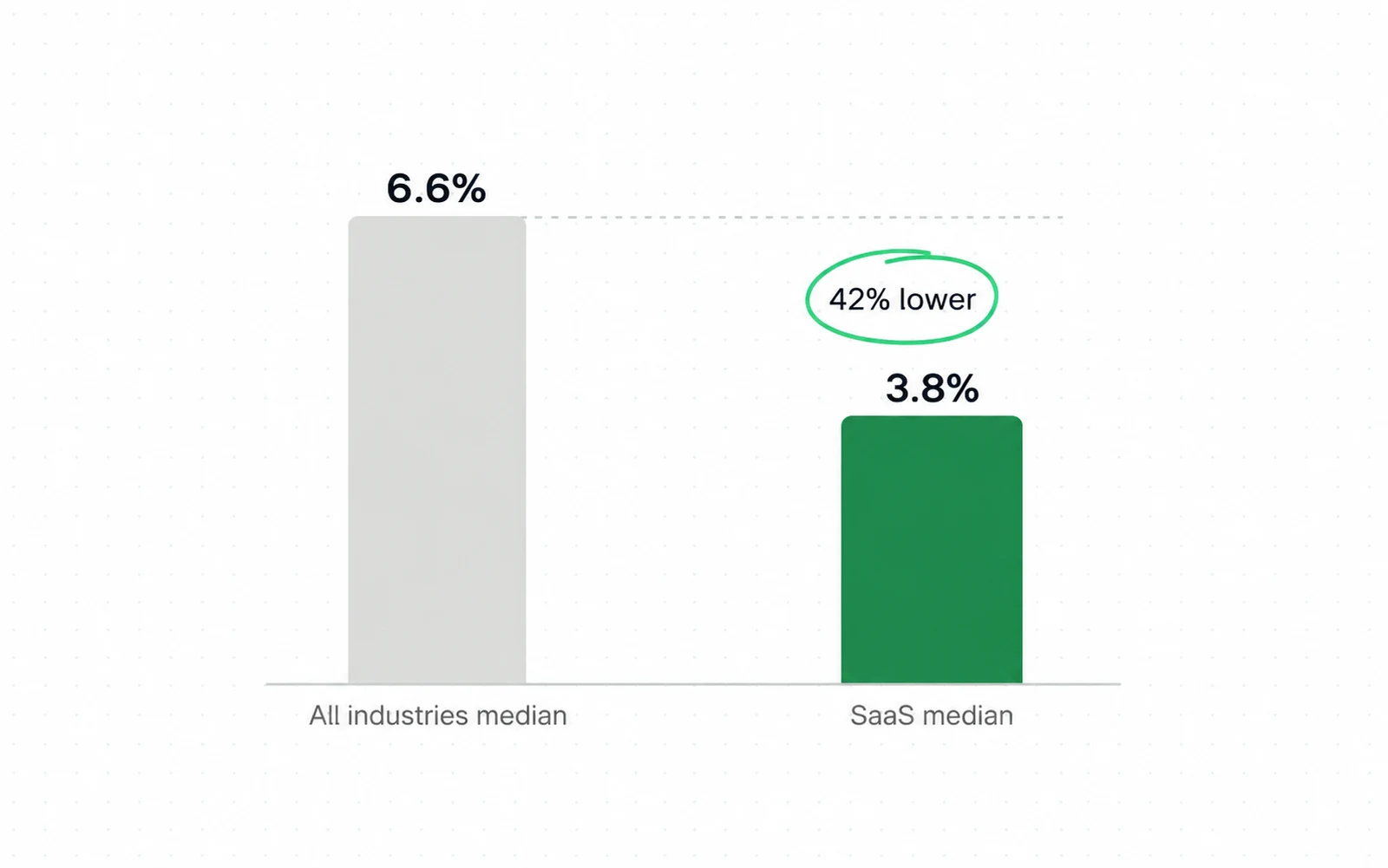
- SaaS landing pages convert at a median of 3.8 percent.
- The all-industry median is 6.6 percent, so SaaS runs about 42 percent below it.
- Inside the category, data and infrastructure pages sit at 3.3 percent and hardware pages at 4.1 percent. The report does not say which pages went into either bucket.
Read the two medians together and a second reading arrives. The gallery pages themselves have not been measured, and the category they belong to sits below the general baseline in the same report.
Where SaaS sits
A later collection restates the same two medians and adds the spread around them, and the spread is what gives the 3.8 percent its meaning.

So a SaaS page at 5 percent is doing well, and a SaaS page at 5 percent looks like failure next to a general benchmark. Picking the wrong comparison is how a working page gets rebuilt.
A second agency publishes a median for the same category and it is 1.1 percent, not 3.8. First Page Sage draws that from conversion data across 80 or more clients between 2021 and 2025.
A factor of three and a half separates them, and a definition put it there. First Page Sage counts a conversion only when it produces a lead: a contact form fill, an appointment booking, a demo signup.
So before you hold your page against either number, find out which event each one counted. A page beating one benchmark and failing the other has not changed; the question asked of it has.
Two more figures travel through the same restatement and neither can be checked at its source. A 2.35 percent ecommerce average sits on a page that answers an automated request with 403.
A 37 percent average gain from testing is worse: the figure cannot be found at the publisher it is credited to. Both are printed here as the attribution they arrive in, because that is all you can verify.
The same collection puts strong performers at 10 to 15 percent in any vertical, so a realistic ceiling for a SaaS page sits well above its own median and near what an events page manages on an average day.
That gap is the useful frame for a rebuild. Moving a page from the median toward that band multiplies the return on traffic you are already buying, and it does so without a single extra visit.
Compare that against buying the same multiple in traffic. One path is a fixed piece of work on one page. The other is a media bill that repeats every month it runs.
Reading level and length: what the report measured
The same report measures a few things the galleries cannot show, because they live in the text and not in the layout. Two of them separate the pages in that sample by more than any visual property the report records.
Start with reading level, where the report records the largest single gap between two groups of pages.

A page written the way a product team talks tends to land at the professional level. That is the register the lower bar was measured on.
Length shows a narrower gap and still has a band. Pages between 250 and 725 words converted best across the sample, so the choice is between a short page and a long one, not between a short page and a document.
A band like that has a reason under it and the reason was measured elsewhere. Jakob Nielsen at the Nielsen Norman Group reports 45,237 instrumented page views, with visitors reading at most 28 percent of the words on an average visit.
The same data puts each extra hundred words at roughly 18 percent read. Words past the band are not neutral for you: they cost attention at a rate somebody has put a number on, and that data was collected in 2005.
Six steps, in order.
For example, you can draft the copy for steps two and three with the copywriting skill. It asks you for the objections in your customer’s words before it writes a headline.
-
Write down last quarter's rate
Conversions divided by visits, for this page only. If the number does not exist yet, that is the first thing to build, not the layout.
-
Compare it against 3.8 percent
That is the SaaS median from a 41,000-page sample. Above it you are in the top half of a low-converting category. Below it you have a measured gap.
-
Check the reading level
Paste the page into any readability tool. The measured band that converted at 12.9 percent sits at fifth to seventh grade.
-
Count the words
The best band was 250 to 725. The benchmark reports the correlation and not a reason for it, so treat any explanation of the band as your own hypothesis.
-
Open it on a phone first
Four in five landing page visits arrive on mobile, so the desktop view you designed against is the minority view.
-
Change one thing and prove it
Run the change as an A/B test with the sample worked out first. A gallery cannot tell you what worked, and neither can a redesign shipped whole.
Traffic source and conversion spread
The widest spread in the report is not a design finding at all. It sits between traffic sources, and its size matters before any page decision, because nothing recorded on the page side comes close to it.
Two windows on the same question, and they are not interchangeable.
| Traffic source | SaaS pages only | All industries |
|---|---|---|
| 16.9 percent | 2.6 percent | |
| Paid search | 4.1 percent | 3.2 percent |
| Paid social | 2.9 percent | 1.5 percent |
| Display | 0.3 percent | not published in this cut |
Read the SaaS column on its own. Email sits at 16.9 percent and display at 0.3 percent, a ratio of about 56 to 1 in the same report.
The report measures that gap and does not explain it, and visitors arriving from an email list are not the same people as visitors arriving from a display placement. Where the traffic comes from is a media decision before it is a page decision.
Both halves land in the same programme. Your page and your traffic mix arrive as one bill. That is how our B2B and SaaS CRO work reads them, because the report shows you cannot separate what you spend from what you convert.
Where the visitor is
One more number reorders the work, and it is the one the galleries quietly contradict.

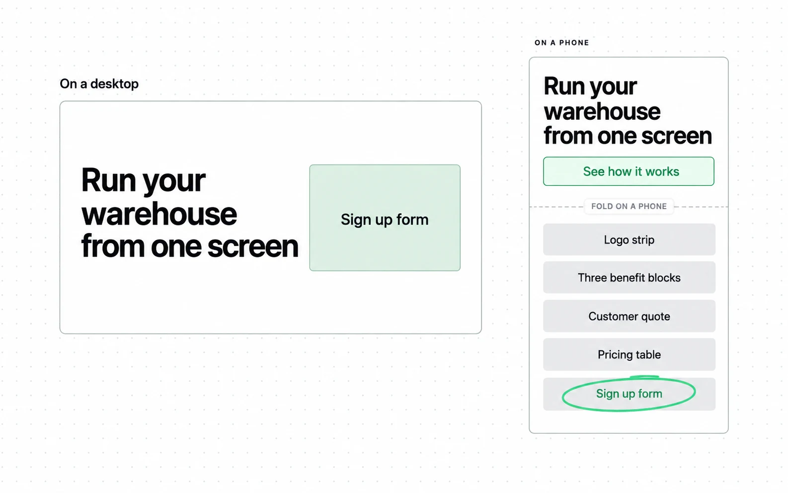
Four visits in five arrive on a phone, and the inspiration is browsed on a laptop. A page can be admired in a gallery and still fail the screen it is used on.
Suppose your own split looks like that: testing the page against it is landing page optimization at Addition, a search marketing agency.
Five limits of an example page
None of these makes a gallery useless. Each one marks something an example cannot carry, so a decision resting on it is resting on nothing, and knowing which is which keeps a copied layout from becoming a copied guess.
What a screenshot leaves out, and what goes wrong when it is treated as evidence.
| What is missing | What it costs you |
|---|---|
| The conversion rate | You cannot tell a winning page from a good-looking one |
| The traffic source | A page fed by email and a page fed by display are judged as equals |
| The offer behind the button | A free trial and a sales demo need different pages, and the screenshot hides which one it was |
| The date it was live | A page from three years ago is judged against today's expectations |
| The mobile view | The layout is assessed on the screen four visitors in five never see |
The largest limit is not in the gallery at all. Ron Kohavi and Roger Longbotham report that only one third of the ideas tested on the Microsoft experimentation platform improved the metric they were built to improve.
Their paper adds that success is harder in a well optimised product, and quotes Jim Manzi putting Google at about 10 percent of experiments leading to business changes. Treat a layout copied from a screenshot as one more untested idea; the paper does not estimate the odds for that case.
A sixth limit belongs to the curator and not to the page. Galleries select on craft, so the sample is filtered by what a designer admired and never by what a business earned.
That filter is worth keeping in mind before a redesign. No gallery publishes what its examples converted at, so a page can pass every taste test here and sit anywhere against the median.
A seventh limit is survivorship, and it runs the other way. The pages a curator collects belong to companies that survived long enough to be noticed, so the set quietly excludes every page that looked the same and failed.
Nothing in a gallery separates the two. Two pages can share a layout, a palette and a hero structure, and one of them belongs to a company that no longer exists.
How to measure the page against your baseline
Three numbers, and the third is the one that turns a redesign into evidence. The first two are already in your analytics, and the third has to be decided before you change anything.
What to report, how often, and what it is for.
| Measure | Cadence | What it is for |
|---|---|---|
| Conversions divided by visits, this page only | Monthly | The rate that goes against 3.8 percent |
| The same rate split by traffic source | Monthly | The spread between sources is the widest in the report, so it gets read first |
| The version and date every rate belongs to | Every change | Without it a rate cannot be attributed to a page |
Report the visit count beside the rate, every time. Four percent on 300 visits and four percent on 30,000 are different facts wearing the same number.
Print the denominator.
Decide the stopping point before the test runs. Sequential-testing work published in 1969 put a number on the cost of watching a test until it looks significant. Two looks roughly double the error rate you think you are running.
Five looks make it about three times, ten looks about four. Those are multiples of your stated error rate, so a redesign called a winner on the fourth morning may only be a winner on the fourth morning.
Then compare the page against its own previous version before comparing it against anybody's screenshot. Your baseline is the only one measured on your traffic, your offer and your buyers.
Sources
- Unbounce SaaS conversion rate benchmark, from the Conversion Benchmark Report
- Unbounce What is a good conversion rate, based on 41,000 landing pages
- Foundry CRO Landing page conversion rate benchmarks, collecting several sources for 2026
- Nielsen Norman Group How little do users read? by Jakob Nielsen, 5 May 2008, on Weinreich, Obendorf, Herder and Mayer, ACM Transactions on the Web 2(1), February 2008
- SaaS Landing Page SaaS landing page examples, publishing 950 of them
- Saaspo 1363 SaaS landing page examples, updated daily
- Dribbble SaaS landing page designs, 7,323 of them
- Landingfolio The best SaaS landing page design inspiration and examples
- Unbounce examples gallery 27 best SaaS landing page examples with tips from the pros, 14 August 2025
- Lapa Ninja SaaS landing pages, 691 B2B examples and templates
- One Page Love SaaS website design inspiration, 150 curated designs
- Behance SaaS landing page projects
- First Page Sage Landing page conversion rates by industry, 2026 report, published 31 January 2025 and updated 23 December 2025
- Ron Kohavi and Roger Longbotham Online Controlled Experiments and A/B Tests, in the Encyclopedia of Machine Learning and Data Mining, edited by Claude Sammut and Geoff Webb, version dated 25 April 2015
- Georgi Georgiev, Analytics Toolkit The bane of A/B testing: reaching statistical significance, 2017
- WordStream Ecommerce landing page average, cited by Foundry CRO
- VWO Average gain from testing, cited by Foundry CRO This page carries no publication date of its own.
Questions people ask
What is a SaaS landing page?
A single page built to turn one campaign's traffic into a trial, a demo or a signup, with no navigation pulling the visitor elsewhere.
The distinction that matters is the measurement. A landing page has one job and one rate, so it can be judged. A home page has several jobs and cannot.
What is a good conversion rate for a SaaS landing page?
Unbounce puts the SaaS median at 3.8 percent, drawn from a report covering 41,000 landing pages and 57 million conversions across industries. The all-industry median is 6.6 percent, so SaaS sits about 42 percent below the general baseline.
Inside SaaS, hardware pages reach 4.1 percent and data and infrastructure pages 3.3 percent. The report does not publish what it counted as either, so treat the split as a direction and not as your bucket.
What are the best landing pages for SaaS?
Example galleries cannot answer that, because a conversion rate never appears beside a screenshot. What they show is which pages a curator liked.
Use them for layout vocabulary. Judge your own page against the 3.8 percent median and against its own previous version.
Should a SaaS landing page be long or short?
In Unbounce's 41,000-page benchmark the measured band is 250 to 725 words, and pages in that range converted best.
The gap by reading level is wider than the gap by length. Copy written at a fifth to seventh grade level converted at 12.9 percent, against 2.1 percent for copy written at a professional level.

